keyboard_arrow_up
keyboard_arrow_down
keyboard_arrow_left
keyboard_arrow_right

The Clean Living Collection

Brand + Packaging Design for Holistic Bodycare
SCROLL DOWN

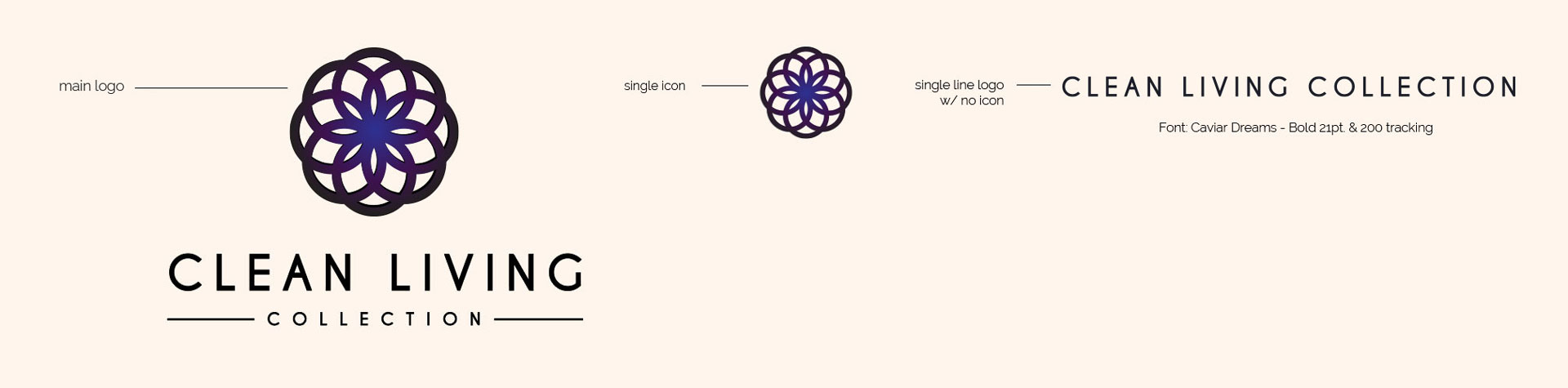
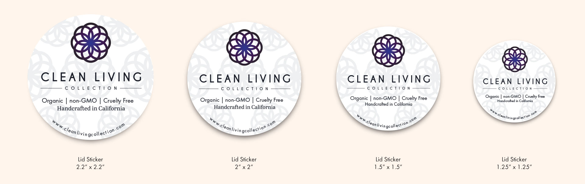
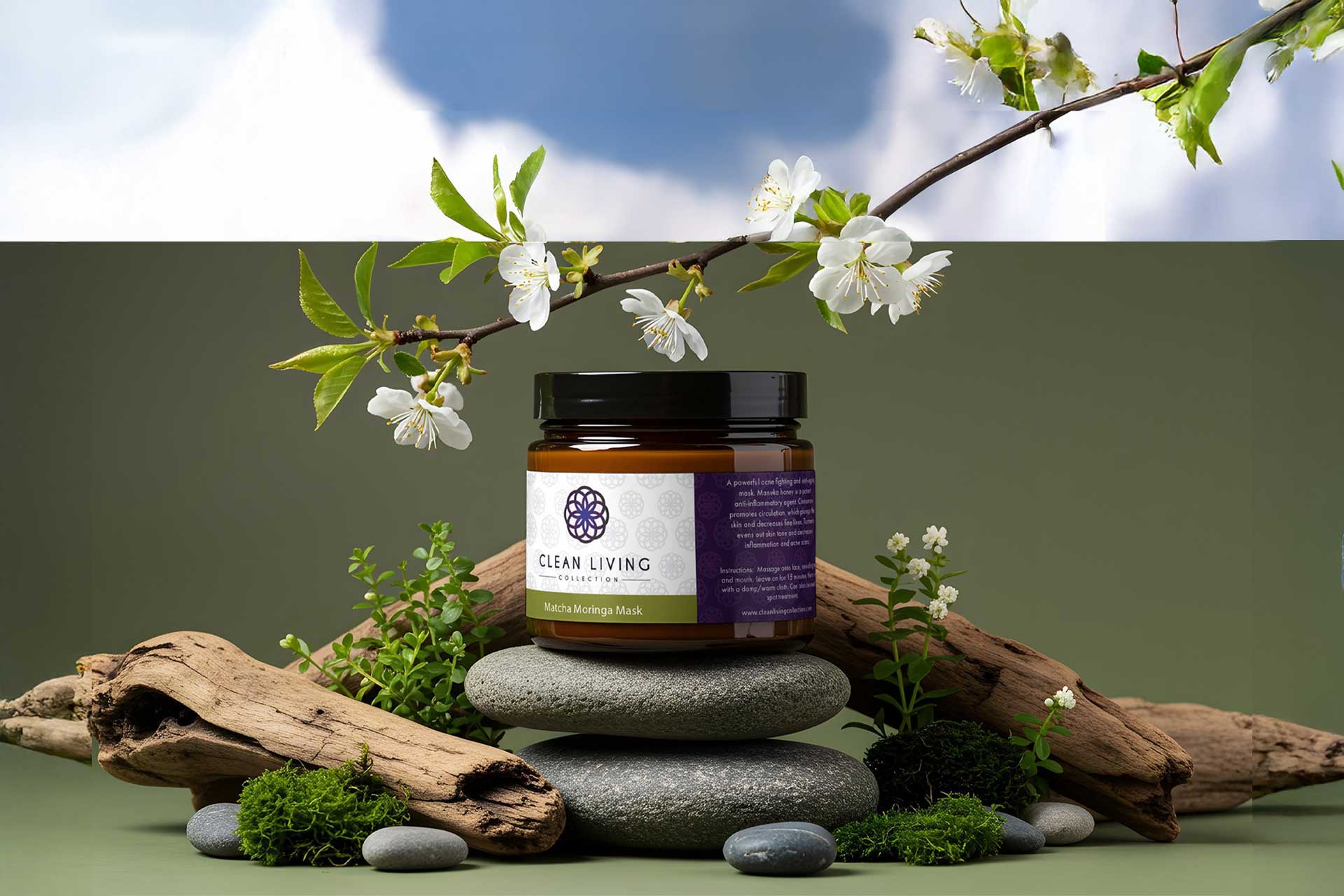
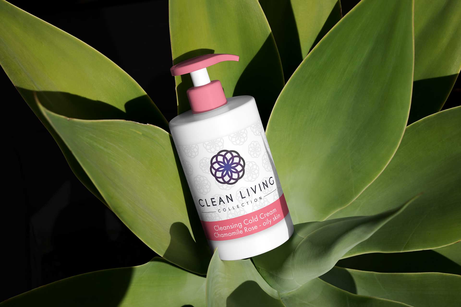
Case Study in Identity + Packaging

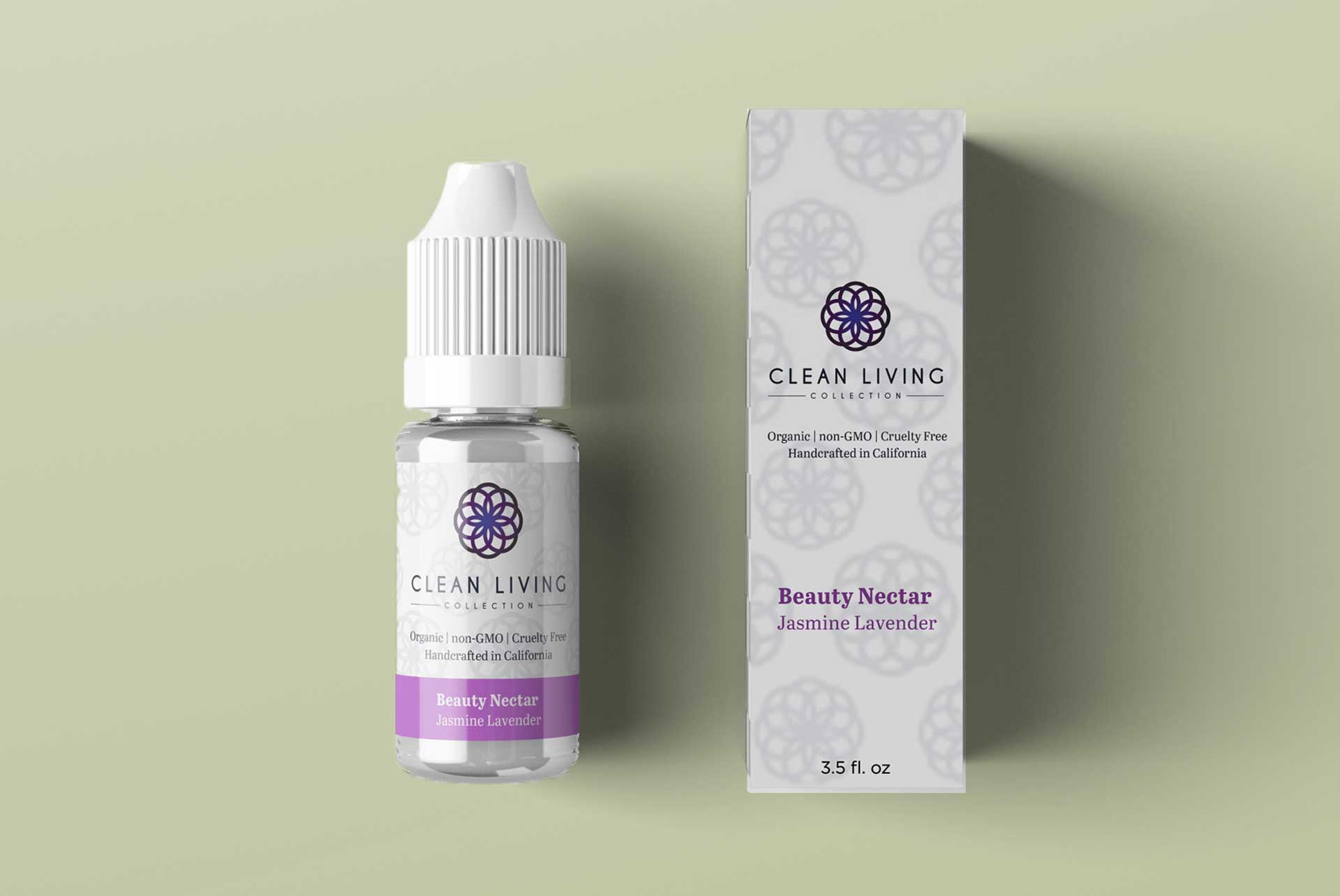
I designed the branding and packaging for The Clean Living Collection, a skincare line built on simplicity and transparency. The visual identity blends minimal design with approachable warmth, creating a clean, modern look that reflects the brand’s mindful approach to beauty.

Role
Freelance Digital Designer
Client
Ariel Welch
Timeline
2017-2018
Objective
Develop Brand + Packaging

I.

Overview

The Clean Living Collection’s branding and packaging were designed to reflect the brand’s commitment to clean, transparent ingredients while remaining warm and approachable. By blending minimalist design with subtle, inviting touches, the visual identity communicates simplicity, mindfulness, and modern elegance. Every element—from typography to color palette and packaging layout—works together to create a cohesive, memorable look that resonates with consumers seeking thoughtful, accessible skincare.

II.

Strategy

The identity combines minimalist design principles with subtle warmth, resulting in a modern, clean aesthetic that feels both refined and accessible. Every element—from typography to color palette and packaging structure—was carefully crafted to communicate clarity, honesty, and thoughtful self-care.

Creative Elements

— Monogram & Logo Options —

— Final Logo —


— Brand Color Palette —


— Packaging Color System —